A Revolutionary Beginning
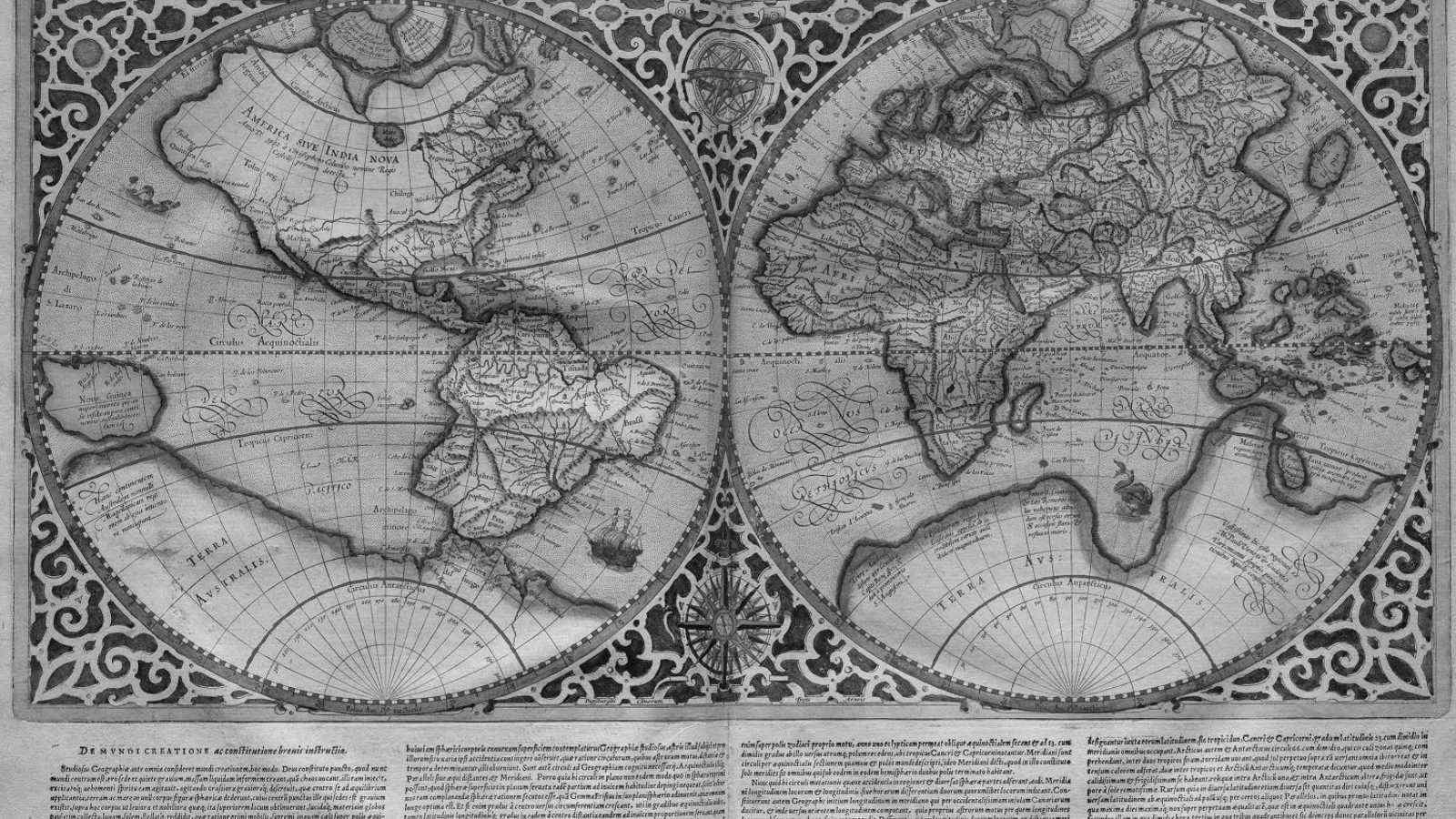
When Flemish cartographer Gerardus Mercator introduced his groundbreaking map titled "Nova et Aucta Orbis Terrae Descriptio ad Usum Navigantium Emendata"(Renaissance Latin for "New and more complete representation of the terrestrial globe properly adapted for use in navigation"), he solved a critical problem for maritime navigation. Unlike the cumbersome Portolan charts and outdated Ptolemaic maps of his era, Mercator's projection allowed sailors to plot straight-line courses across oceans using constant compass bearings; a revolutionary advancement that made oceanic navigation significantly more practical and precise. This innovation made the Mercator projection the gold standard for maritime navigation and, eventually, the default choice for world maps in classrooms, atlases, and media representations globally.
The Mercator projection's navigational advantages come with a significant trade-off: extreme distortion that increases exponentially as you move away from the equator. The projection maintains straight, perpendicular latitude and longitude lines by stretching the spacing between latitude lines, particularly near the poles. This mathematical necessity creates dramatic size distortions for landmasses at higher latitudes.
The results are staggering. Greenland, positioned far north, appears larger than Africa, when in reality Africa is approximately 14 times larger. Russia and Canada appear massively oversized, while Antarctica stretches across nearly half the bottom of the map despite being smaller than both Africa and Asia. Europe, positioned in the northern latitudes, appears disproportionately large compared to equatorial regions, particularly Africa and South America.
What makes these distortions particularly problematic is their alignment with historical colonial power structures. Europe's outsized appearance on Mercator maps served as a visual reinforcement of European colonial dominance during the height of imperialism, slavery, and colonial exploitation. The map created a visual hierarchy that placed European territories at the center and made them appear larger and more significant than the colonized territories they were exploiting.
This cartographic eurocentrism has had lasting psychological and cultural impacts. When the world's most widely used map consistently presents Africa, the world's second-largest continent by both area and population, more marginal than it actually is, it reinforces narratives of African insignificance that have persisted well beyond the formal end of colonialism.
The African Union's Response and "Correct the Map" Movement
Recent developments have brought this issue to the forefront of international discourse. The African Union has backed a campaign to phase out the Mercator projection in favor of more accurate representations. While the Gall-Peters projection was previously developed to challenge Mercator's distortions, the Equal Earth projection, developed in 2018, has emerged as the preferred alternative. Designed to be more aesthetically pleasing while balancing accuracy and visual harmony, Equal Earth is particularly well-suited for thematic maps and global data visualization, making it the choice being pushed for global acceptance and utilization.
The AU's position reflects a broader understanding that maps are not neutral, they shape perceptions, influence policy decisions, and affect how entire populations view themselves and their place in the world. The AU aligns with grassroots advocacy efforts that have been building momentum for years. The "Correct the Map" campaign, spearheaded by organizations like Africa No Filter and Speak Up Africa, has been pushing international organizations to adopt more accurate projections. Their efforts have already seen some success: the World Bank and United Nations have begun incorporating Equal Earth projections for static maps and are gradually phasing out Mercator projections for online mapping applications.
Perhaps the most concerning aspect of Mercator's continued dominance is its impact on African children's self-perception. As Fari Ndiaye, co-founder of Speak Up Africa, has articulated, encountering distorted maps in classrooms can have profound psychological effects on young minds. When children repeatedly see their continent depicted as smaller and less significant than it actually is, it can reinforce feelings of marginalization and inferiority, even subconsciously.
This educational dimension of cartographic bias represents a form of ongoing colonial influence in African classrooms. Despite Africa's massive size, diverse economies, and crucial role in feeding the world through agricultural exports, students are presented with visual representations that systematically diminish their home’s apparent importance.
Pushback and the Path Forward
Of course, not all responses have been supportive. Some Western commentators dismiss the initiative as symbolic politics, arguing that map projections are always distortions of a round earth and that no single system can perfectly capture reality. Others note that Mercator remains the most practical projection for navigation and digital mapping, since its grid preserves angles and direction. Google Maps, for instance, relies on Mercator because it allows users to scroll and zoom with consistent bearings.
Yet even here, the AU's point stands: why should a tool designed for 16th-century sailors remain the standard for how billions of people visualize the world today? The technical requirements for maritime navigation are vastly different from the needs of global education, media representation, and public understanding of 21st century geopolitical relationships.
Maps don't just show physical geography; they shape mental geography. When Africa appears small on the world's most common maps, it becomes habitual for policymakers, media outlets, and the general public to treat African issues as peripheral concerns.
These organizations’ collaborative initiatives recognize that decolonization isn't just about political independence, it's also about dismantling the visual and psychological frameworks that continue to marginalize formerly colonized regions. By advocating for accurate cartographic representations, African leaders are asserting that their continent deserves to be seen for what it truly is: a massive, resource-rich, population-dense region that plays a central role in global affairs.
As international organizations gradually adopt more accurate projections like Equal Earth, we're witnessing a quiet but significant shift in how the world is represented visually. Maps do more than show where things are, they show how to think about the relative importance of different places and peoples. In correcting these distortions, we take a small but meaningful step toward a more accurate and equitable global perspective.